
All · Ads & posters · Restaurants · Cafés & desserts
243Sandwich Ingredient Breakdown
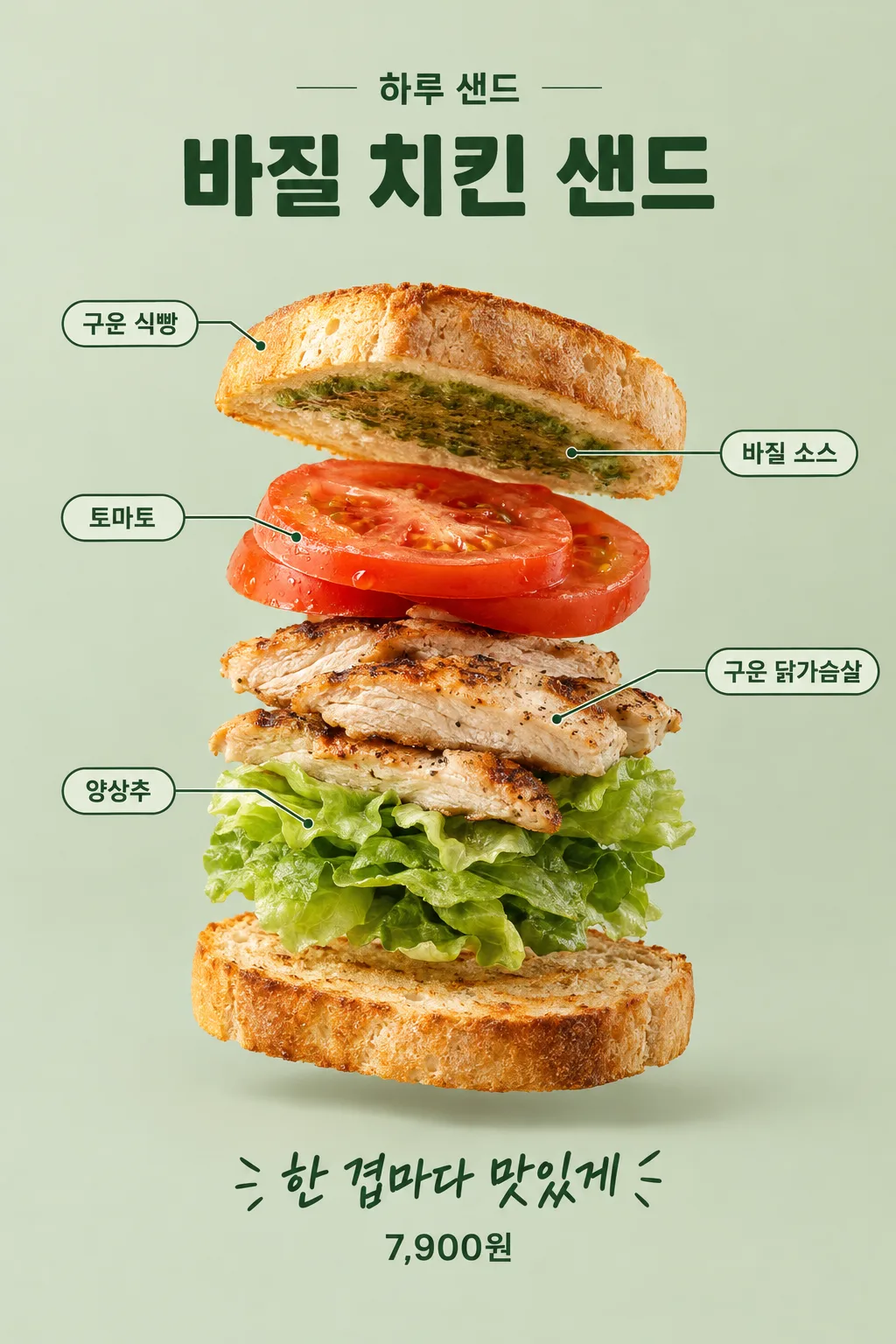
Bread and fillings float layer by layer, connected by name tags. This is a food advertisement showing the composition of a sandwich.
What you get
- Sandwich Ingredient Breakdown
Fill in the fields
- 1Fill in the fields
- 2Copy the prompt
- 3Paste it into a GPT chat
- 4Send it as is and you get an image like the thumbnail example
- 5Attach a real photo that fits the card and it is used in the result: a background photo for background cards, a person or food photo for those cards Optional
Full prompt 4,684 characters
Generate this image now. Return exactly ONE complete image directly. Do not ask questions, browse for photos, return a plan or give a prompt instead of the image.

Output exactly one finished 2:3 portrait image, 1024x1536 pixels. Leave the top 12% and bottom 15% free of essential text.

[Input: values are the only facts and wording]
SHOP: "【Shop Name】"
MENU: "【Menu Name】"
LAYERS: "【Ingredient Composition】"
COPY: "【Bottom Line】"
PRICE: "【Selling Price】"
LABELS: "【Ingredient Names to Display】"
SAUCE: "【Where Sauce is Applied】"
DETAIL: "【Texture to Emphasize】"
BACKGROUND: "【Background Color】"

[Fixed card design]
Combine commercial food-studio photography with a precise exploded sandwich composition. One sandwich assembly only, viewed at a slight three-quarter angle: physically separate the solid layers on the same central axis in the exact top-to-bottom order of LAYERS. The two bread pieces are ordinary slices or bun halves with real crumb pores and uneven toasted edges. Tomato, cooked chicken fibers and lettuce folds retain their true thickness. No finished sandwich at the base, no duplicate serving. Warm diffuse left light, mild opposite rim light and believable small floating shadows, against BACKGROUND.
CRITICAL SAUCE MATERIAL: a named spread is NOT a free-floating solid ingredient layer. Render it as a very thin moist smear adhering to the face specified by SAUCE. By default it adheres to the underside of the top bread. Its irregular edge and small glints are visible in the three-quarter view; never make a thick green sheet, slab, leaf-shaped patty or floating ribbon. Keep the sauce in the declared ingredient order by placing it at the adjacent bread face, without giving it an invented solid thickness.
CRITICAL LABEL PLAN: first silently deduplicate the exact names in LABELS, or if LABELS is absent, the names in LAYERS. Only labels for actual supplied ingredients are valid. Each distinct name gets EXACTLY ONE visible label and ONE leader line. Repeated top and bottom bread share ONE bread label whose line points to the top bread only. The bottom bread has NO label or leader line. The sauce has its own one label pointing to the thin visible spread on the bread face. Do not write a second bread label, combine different ingredients under one label or omit sauce. Alternate small labels on the left and right; lines never cross lettering or a food layer.
MENU is bold deep-green lettering above the assembly, SHOP smaller above it. COPY supports the assembly near the bottom; PRICE, if supplied, is smaller clear exact typography beneath it. Keep the central separated solid ingredients large and detailed, emphasizing DETAIL if supplied. Only SHOP, MENU, one label per unique enabled ingredient, COPY and PRICE may be visible. No nutrition, origin, discount, certificate or filler wording.

[Button meanings, internal instructions only]
BACKGROUND: "Pale sage" means pale sage; "Warm cream" means warm cream; "Pale apricot" means pale apricot.

[Missing inputs and finish]
An optional input line removed from this prompt is absent. Do not print its key, invent a substitute caption, ask for it or reserve an empty panel. Choose a fitting simple visual only where the fixed design explicitly permits an automatic default. Selected values alter content only; retain this card's single style and one composition. Every supplied visible string stays verbatim in its original script and currency, without translation. Ordinary automatic lettering, if explicitly allowed above, is English; internal English keys and button names are never captions.
Use the stated aspect ratio, adapting one coherent layout rather than stretching food or letters. Text-bearing posters keep important lettering within the central 16–83% of image height and 5–95% of width; extend food-related ornament, background, shadows or texture to the trim so these insets do not create empty bands. Keep all price digits and ingredient labels unobstructed. Text-free photographs fill the canvas naturally with their scene. No frame, phone, wall mockup, watermark or extra results.
No uploaded photo is needed: create a fictional food scene from these inputs. If a reference photo is attached, use it only for the stated food's visible shape and materials within this same drawing or photographic medium, without adding absent products or claiming exact portion preservation. Finish one image even when no photo is attached.

[Final output format]
Output exactly one finished 2:3 portrait image, 1024x1536 pixels. Leave the top 12% and bottom 15% free of essential text.
This selected output format takes priority over any fixed canvas size or aspect ratio elsewhere in this template. Adapt the composition, text zones and margins to the selected canvas without stretching or cropping essential content. Device safe areas apply only when a device is selected. Never print these format instructions on the image.
How did it turn out?
You may also like


How to use it · FAQ
Showing the Sandwich Fillings Layer by Layer
This is an advertisement that shows the composition of the sandwich by floating sliced bread, tomatoes, chicken, and lettuce layer by layer in the air. Unlike posters that only feature a completed sandwich photo, the thickness and order of the ingredients stand out. Use this when explaining ingredients in a brunch menu introduction or a new product feed. The basil sauce is spread thinly on the bread, and the name tags for the two slices of bread appear only once.
Written from Top to Bottom
Fill in the shop name, menu name, ingredient composition, and the bottom line. The ingredient composition follows the top-to-bottom order, such as "toasted bread, basil sauce, tomatoes, grilled chicken breast, lettuce, toasted bread." It looks best to divide it into roughly four to five large layers including the bread. While the sauce is listed by name, it is not made into a thick floating plate, but rather spread thinly on the side of the bread. Leaving the selling price blank omits the price.
Check the Name Tags and Sauce Surface
For the ingredient names to display, write down only the names that should be shown, separated by commas. Even if there is identical bread at the top and bottom, "toasted bread" is written only once. Leaving it blank combines identical names from the ingredient composition to create name tags. For where the sauce is applied, select an option like "Spread basil sauce thinly on the bottom side of the top bread." For the texture to emphasize, write down one visible feature, such as grill marks, meat grain, or an egg cross-section. Choose the background from sage, cream, or apricot.
Be Sure to Check Two Things in the Result
Send the completed text to the image-generating GPT once and request a breakdown advertisement. First, check if the bread name tags appeared twice. Next, verify whether the sauce is floating like a thick green plate. If incorrect, fix that specific part, such as "Delete the bottom bread label and attach the sauce thinly to the bottom of the top bread." Since writing ingredient names does not always guarantee accurate text and counts, read through the layer order and prices as well. When announcing actual menu quantities and ingredients, you must separately verify whether the virtual image matches your actual sandwich.