
すべて · 広告・ポスター · 飲食店 · カフェ・スイーツ
243サンドイッチの具材分解
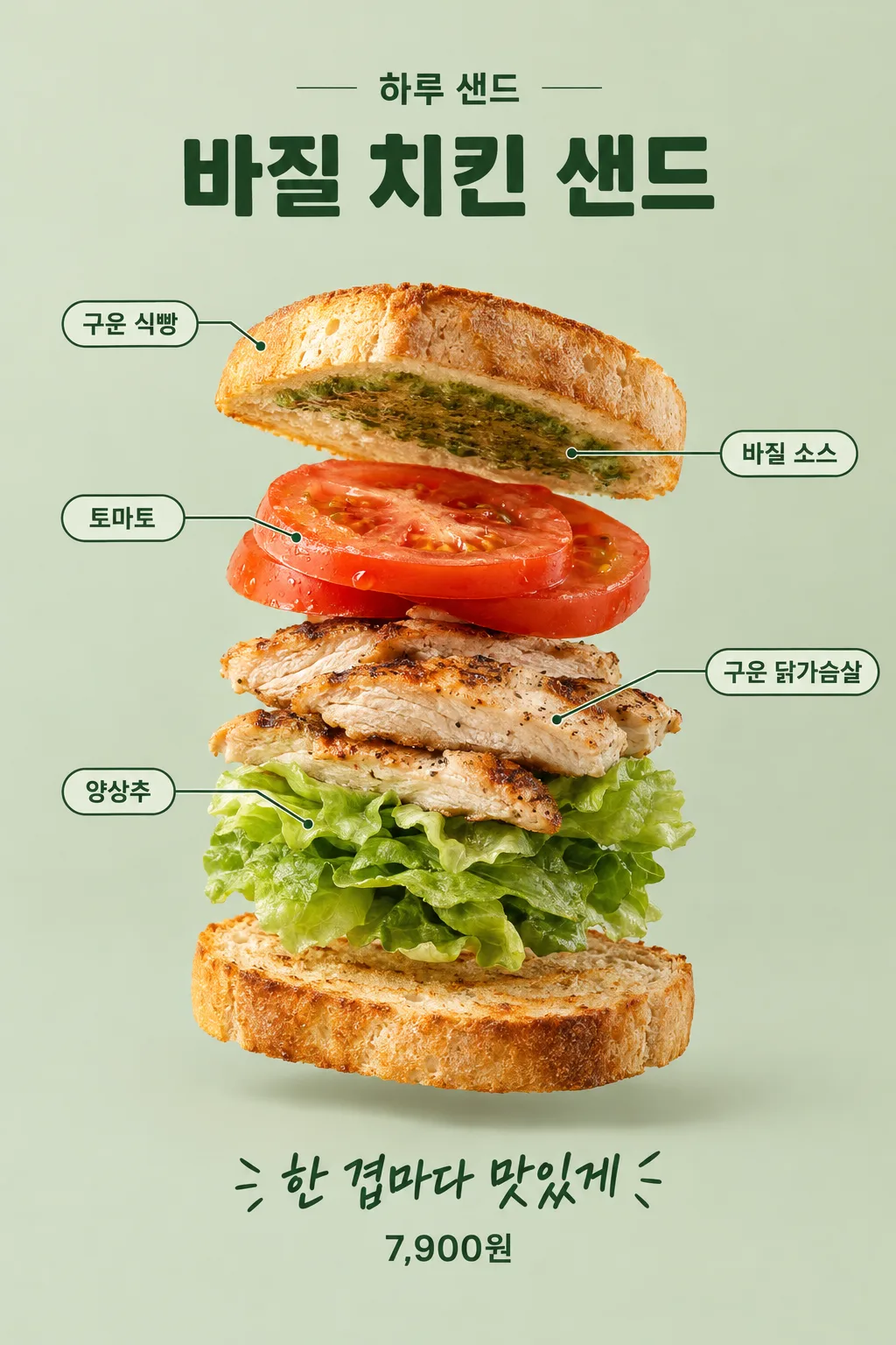
パンと具材を1層ずつ浮かばせ、名札で繋ぎます。サンドイッチの中身の構成を示すフード広告です。
受け取れるもの
- サンドイッチの具材分解
項目を入力
- 1項目を入力します
- 2コピーを押します
- 3GPTのチャットに貼り付けます
- 4そのまま送ると、サムネイルの例のような画像になります
- 5カードに合う実際の写真を一緒に入れると反映されます。背景カードなら背景の写真、人物・料理カードならその写真 任意
プロンプト全文を見る 4,575文字
Generate this image now. Return exactly ONE complete image directly. Do not ask questions, browse for photos, return a plan or give a prompt instead of the image.

完成した2:3の縦型画像を1枚、1024×1536ピクセルで出力してください。重要な文字は上12%と下15%に置かないでください。

[Input: values are the only facts and wording]
SHOP: "【店名】"
MENU: "【メニュー名】"
LAYERS: "【具材構成】"
COPY: "【下の1行】"
PRICE: "【販売価格】"
LABELS: "【表示する具材名】"
SAUCE: "【ソースがつく場所】"
DETAIL: "【強調したい食感】"
BACKGROUND: "【背景色】"

[Fixed card design]
Combine commercial food-studio photography with a precise exploded sandwich composition. One sandwich assembly only, viewed at a slight three-quarter angle: physically separate the solid layers on the same central axis in the exact top-to-bottom order of LAYERS. The two bread pieces are ordinary slices or bun halves with real crumb pores and uneven toasted edges. Tomato, cooked chicken fibers and lettuce folds retain their true thickness. No finished sandwich at the base, no duplicate serving. Warm diffuse left light, mild opposite rim light and believable small floating shadows, against BACKGROUND.
CRITICAL SAUCE MATERIAL: a named spread is NOT a free-floating solid ingredient layer. Render it as a very thin moist smear adhering to the face specified by SAUCE. By default it adheres to the underside of the top bread. Its irregular edge and small glints are visible in the three-quarter view; never make a thick green sheet, slab, leaf-shaped patty or floating ribbon. Keep the sauce in the declared ingredient order by placing it at the adjacent bread face, without giving it an invented solid thickness.
CRITICAL LABEL PLAN: first silently deduplicate the exact names in LABELS, or if LABELS is absent, the names in LAYERS. Only labels for actual supplied ingredients are valid. Each distinct name gets EXACTLY ONE visible label and ONE leader line. Repeated top and bottom bread share ONE bread label whose line points to the top bread only. The bottom bread has NO label or leader line. The sauce has its own one label pointing to the thin visible spread on the bread face. Do not write a second bread label, combine different ingredients under one label or omit sauce. Alternate small labels on the left and right; lines never cross lettering or a food layer.
MENU is bold deep-green lettering above the assembly, SHOP smaller above it. COPY supports the assembly near the bottom; PRICE, if supplied, is smaller clear exact typography beneath it. Keep the central separated solid ingredients large and detailed, emphasizing DETAIL if supplied. Only SHOP, MENU, one label per unique enabled ingredient, COPY and PRICE may be visible. No nutrition, origin, discount, certificate or filler wording.

[Button meanings, internal instructions only]
BACKGROUND: "薄いセージ色" means pale sage; "温かみのあるクリーム色" means warm cream; "薄いアプリコット色" means pale apricot.

[Missing inputs and finish]
An optional input line removed from this prompt is absent. Do not print its key, invent a substitute caption, ask for it or reserve an empty panel. Choose a fitting simple visual only where the fixed design explicitly permits an automatic default. Selected values alter content only; retain this card's single style and one composition. Every supplied visible string stays verbatim in its original script and currency, without translation. Ordinary automatic lettering, if explicitly allowed above, is Japanese; internal English keys and button names are never captions.
Use the stated aspect ratio, adapting one coherent layout rather than stretching food or letters. Text-bearing posters keep important lettering within the central 16–83% of image height and 5–95% of width; extend food-related ornament, background, shadows or texture to the trim so these insets do not create empty bands. Keep all price digits and ingredient labels unobstructed. Text-free photographs fill the canvas naturally with their scene. No frame, phone, wall mockup, watermark or extra results.
No uploaded photo is needed: create a fictional food scene from these inputs. If a reference photo is attached, use it only for the stated food's visible shape and materials within this same drawing or photographic medium, without adding absent products or claiming exact portion preservation. Finish one image even when no photo is attached.

[Final output format]
完成した2:3の縦型画像を1枚、1024×1536ピクセルで出力してください。重要な文字は上12%と下15%に置かないでください。
This selected output format takes priority over any fixed canvas size or aspect ratio elsewhere in this template. Adapt the composition, text zones and margins to the selected canvas without stretching or cropping essential content. Device safe areas apply only when a device is selected. Never print these format instructions on the image.
結果はどうでしたか?
こちらのカードも人気です


使い方・よくある質問
サンドイッチの中身を1層ずつ見せます
食パン・トマト・チキン・レタスを空中に1層ずつ浮かばせて中身の構成を見せる広告です。完成したサンドイッチの写真だけを置くポスターとは異なり、具材の厚みや順序が目に留まります。ブランチメニューの紹介や新商品のフィードで具材を説明するときに使います。バジルソースはパンに薄くつき、パン2枚の名札は1回だけ出る構成です。
上から下の順序通りに書きます
店名・メニュー名・具材構成・下の1行を埋めます。具材構成は「トーストした食パン、バジルソース、トマト、グリルした鶏むね肉、レタス、トーストした食パン」のように上から下の順序です。パンまで含めてだいたい4〜5個の大きな層にすると見栄えが良くなります。ソースは名前をリストに書きますが、空中に浮いた厚い板としては作らず、横のパンの面に薄く塗ります。販売価格を空欄にすると価格が抜けます。
名札とソースの面を確認します
表示する具材名には、必ず見せる名前だけをカンマで区切って書きます。上下に同じパンがあっても「トーストした食パン」は1回だけ書きます。空欄にすると具材構成から同じ名前をまとめて名札を作ります。ソースがつく場所は「一番上の食パンの下面にバジルソースを薄く塗る」のような選択肢を押せば大丈夫です。強調したい食感には、焼き色・肉の繊維・卵の断面のように1つの目に見える特徴を書きます。背景はセージ・クリーム・アプリコットの中から選びます。
結果では2つの点を必ず確認してください
絵を作成するGPTに完成した文章を1回送り、分解広告を1枚リクエストします。まず、パンの名札が2回出ていないか見てください。次に、ソースが厚い緑色の板のように浮いていないか確認します。間違っている場合は「下のパンのラベルを消して、ソースは上のパンの下面に薄くつけて」のように該当部分を修正します。具材の名前を書き留めておいたからといって文字と数が常に正確に出るとは限らないため、層の順序や価格も読んでみてください。実際のメニューの量や具材をお知らせする際には、仮想の絵と私たちのサンドイッチが同じかどうか個別に照合する必要があります。