
All · Infographics & guides · Store notices
262Halloween Candy Giveaway Sign — "Come Get Your Candy" for the Shop Entrance
Enter your shop name, giveaway date and time to get a cute Halloween sign telling kids how to get candy — say "Trick or Treat!" and get one.
ChatGPT Free OK
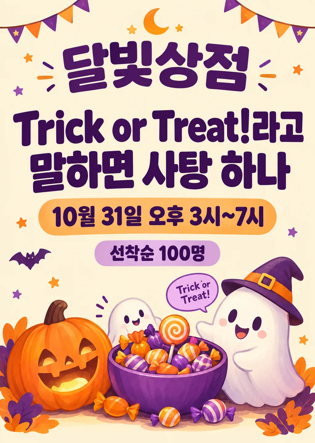
Fill in the fields
- 1Fill in the fields
- 2Copy the prompt
- 3Paste it into a GPT chat
- 4Send it as is and you get an image like the thumbnail example
- 5Attach a real photo that fits the card and it is used in the result: a background photo for background cards, a person or food photo for those cards Optional
Full prompt 9,328 characters
Generate this image now. Draw it directly - do not describe it, explain it, or ask questions.
Output size 2480x3508 pixels, A4 portrait, 300dpi, print-ready poster.
PHOTO RULE (this overrides any other line in this prompt, before or after it, that calls the photo required or mandatory or says to ask for it): if a photo is attached, use it exactly as the instructions below describe. If no photo is attached, never ask for one and never stop — invent a fitting fictional subject (person, pet, food, product or place, whatever this card is about) in the spirit of the card's example image, and finish the image.

[One shop entrance sign; define the actual offer first]
Create exactly ONE friendly professional A4 portrait Halloween candy-giveaway sign for a shop entrance or counter. The shop name and the owner's complete collection instruction are the two biggest text elements. Use the canvas on line two, defaulting to A4 portrait. Render the finished sign flat and straight on, not a photo of an easel, storefront, candy package, phone screen, mockup or multiple alternative designs.
SHOP_NAME = "【Shop name】". Print the complete supplied shop name exactly once, prominently.
DATE_TIME = "【Giveaway date and time】". Print the complete supplied date and time exactly once; no automatic extra year, weekday or changed hours.
CLAIM = "【How to get it】". This is the authoritative complete instruction for receiving candy, rendered verbatim once as the largest message. Never rewrite its password, number of sweets, recipient category or required action.
PASSWORD = "【Magic words】". This optional choice may appear as a small friendly ghost speech bubble only when it adds a compatible greeting not already contained in CLAIM. If CLAIM already contains this password, including a punctuation variant, do not print a duplicate bubble. If CLAIM explicitly states a different password, omit the conflicting bubble and preserve CLAIM exactly. Never create a second eligibility rule or change CLAIM to match this selector.
CONDITION = "【Limits or conditions】". If absent, add no quantity or eligibility condition. Otherwise print the exact supplied wording once in a clearly readable supporting line.
PALETTE = "【Colors】". If absent, use orange and purple with a warm cream base. Yellow/black uses warm yellow, near-black and clean off-white; pastel uses pale peach, lavender and mint with dark plum lettering for contrast. This selected color direction replaces the other palettes throughout.

[Fallbacks for absent input lines]
When an optional named input line is absent, resolve PALETTE to orange/purple on warm cream. PASSWORD and CONDITION are absent unless their own lines are supplied. Active lines above always take precedence over this fallback map.

[Input resolution]
Resolve the named inputs BEFORE planning the image. An optional input exists only when its own input line is supplied; blank values and "None selected" mean absent. "Choose for me" are automatic-choice MENU COMMANDS, never visible copy: choose a fitting concrete result yourself. Never print a selector, field label, these commands, or placeholder braces. Defaults apply only to absent inputs. A supplied choice replaces its corresponding default everywhere; subsequent scene descriptions refer to the resolved named value, never to a competing fixed default.
Only SHOP_NAME, DATE_TIME, CLAIM, active CONDITION and a nonduplicate compatible PASSWORD may become visible words. No extra fixed headline, invented slogan, participation step, admission fee, purchase minimum, age cutoff, costume requirement, candy quantity, allergy assurance, opening hour or stock disclaimer. The owner determines the offer. A supplied condition is genuine content; blank space is not permission to add terms. Never translate, shorten or paraphrase the receiving instruction just to fit the design.

[Design and distant readability]
Make a cohesive retail event sign with abundant clear lettering, cheerful original illustrated characters and a warm dense visual base. Build its identity from two strong type masses and one integrated candy scene, not a grid of tiny information cards or scattered stationery icons. Keep page-edge print margins of at least 8 mm. Keep essential text below the top 12% and above the bottom 15% so a listing overlay also leaves it visible. The background is mostly warm cream or a very pale selected tint with dark lettering; colorful shapes and illustration accents carry the festive palette. Avoid patterned backgrounds underneath any essential sentence.

At approximately y=15-24%, SHOP_NAME spans about 80-88% of the width, using a thick clean rounded Korean sans-serif or equally legible original-language display face. It should be the second-largest text mass, visibly naming the shop from a distance. Set CLAIM around y=29-52% in the largest heavy type, using two or three substantial meaning-preserving lines with compact balanced spacing. Break only at natural word boundaries; keep the Korean particles with their words and keep a number with its unit. Aim for the main sentence to remain readable from two to three meters on an A4 print. Give it the strongest contrast and no playful letter distortion. Never omit the words specifying exactly who receives how many candies.

At approximately y=56-64%, render DATE_TIME in a distinct bold supporting line or two lines if necessary, still large enough for a customer to read without stepping close. CONDITION, when active, sits directly below around y=66-71%, smaller than the date but in firm readable type, not tiny gray legal copy. For a short CONDITION use a simple low-contrast horizontal color band integrated into the sign; for a longer one use calm open background and a natural line break. Do not add "date", "conditions" or other field labels. Use these normalized regions as a hierarchy, adjusting gently for longer real inputs while keeping all required wording and avoiding the protected margins.

[Original candy scene, subordinate to the instructions]
Place a compact appealing illustration around the lower right and lower center, mainly y=70-94%, with supporting accents at the sides of the large type. Draw one generous round bowl of loose candies, a warm smiling ribbed pumpkin lantern and one small friendly ghost leaning toward the bowl with an inviting gesture. A second tiny ghost may peek around the bowl if it improves the composition, without adding another text phrase. Use layered scale, precise overlaps, believable rounded volume, little reflected light and clean confident contours to give the illustration substantial crafted detail. Keep pumpkin, ghost and candy as a connected vignette with a shared grounding shadow, not three unrelated sticker icons. Their edges may overlap empty background beside the main type, but must never cover a letter, date, time, number or condition.

Candies are original unbranded shapes: loose striped round sweets, soft twist-wrapped candies with plain color wrapping and one simple spiral lollipop. No logo, manufacturer mark, commercial wrapper layout, branded colors arranged as a recognizable package, snack name, ingredient text, barcode, invented product label or readable packaging lettering. The pumpkin has a happy carved face and warm internal light; the ghost is rounded and nonthreatening. Render the illustration in a polished contemporary gouache-like cartoon medium with soft dimensional shading, distinct material detail and crisp silhouette edges. Keep all creatures newly invented, with no imitation of entertainment characters or famous monsters.

[Optional password bubble and typography discipline]
If the resolved PASSWORD genuinely adds a compatible separate greeting, use one small speech bubble near the ghost around y=73-81%, printing that phrase verbatim once. Suppress the bubble entirely when the password is already in CLAIM, instead of adding repeated lettering or an empty bubble. This decoration must remain smaller than DATE_TIME and CONDITION. Do not turn it into an alternate instruction, and never let it take priority over the owner's exact receiving sentence. Whenever the supplied CLAIM already contains the resolved password, the claim sentence is its sole appearance; no duplicate speech bubble is allowed.

[Exact offer and final check]
Inspect every Hangul syllable, digit, punctuation mark, tilde, exclamation mark, spacing and time expression against the resolved inputs. Preserve the quantity in CLAIM and any limit in CONDITION; do not infer a different number from the illustrated bowl. SHOP_NAME and CLAIM must be readable first, DATE_TIME next, CONDITION next, with illustrations supporting this order. Check strong contrast, robust type weight, safe print margins and no obscured words. All text must be supplied content and appear once. No automatic-choice commands, form labels, real-film homage, trademarks, candy packaging text, blood, wounds, injury, watermark, signature or explanatory answer. Return one finished print-ready Halloween giveaway sign.

[Final output format]
Output size 2480x3508 pixels, A4 portrait, 300dpi, print-ready poster.
This selected output format takes priority over any fixed canvas size or aspect ratio elsewhere in this template. Adapt the composition, text zones and margins to the selected canvas without stretching or cropping essential content. Device safe areas apply only when a device is selected. Never print these format instructions on the image.
How did it turn out?
You may also like
How to use it · FAQ
When to use it
Use it in a shop that wants to hand out candy to neighborhood kids on Halloween. It's a cute sign that shows how to get candy at a glance, like "Say Trick or Treat! for one candy". Kids come in, the parents with them take another look at your shop, and a few bags of candy put your name on the neighborhood map.
Filling in the fields
Always fill in the shop name, the giveaway date and time, and how to get it. "How to get it" is the biggest line on the sign, so shorter is better. Add a limit such as "First 100 kids" or "Until the candy runs out" and it goes in small print, so a long line doesn't turn into an argument.
What to check
- Are the date, time and conditions exactly as typed?
- No candy brand names or packaging text? The sign shouldn't look like an ad for a product
- Can the "how to get it" line be read from a distance?
Fixing what's off
Ask in the same chat, one thing at a time: "Make the how-to line bigger", "Add one more ghost", "Change the time to 4–8 p.m.".
FAQ
- What about allergies? Write something like "Our candy is nut-free" in the conditions field and it's added to the sign. Check the ingredients of the actual candy yourself.