
すべて · 広告・ポスター · 飲食店 · カフェ・スイーツ
239チョーク皿ポスター
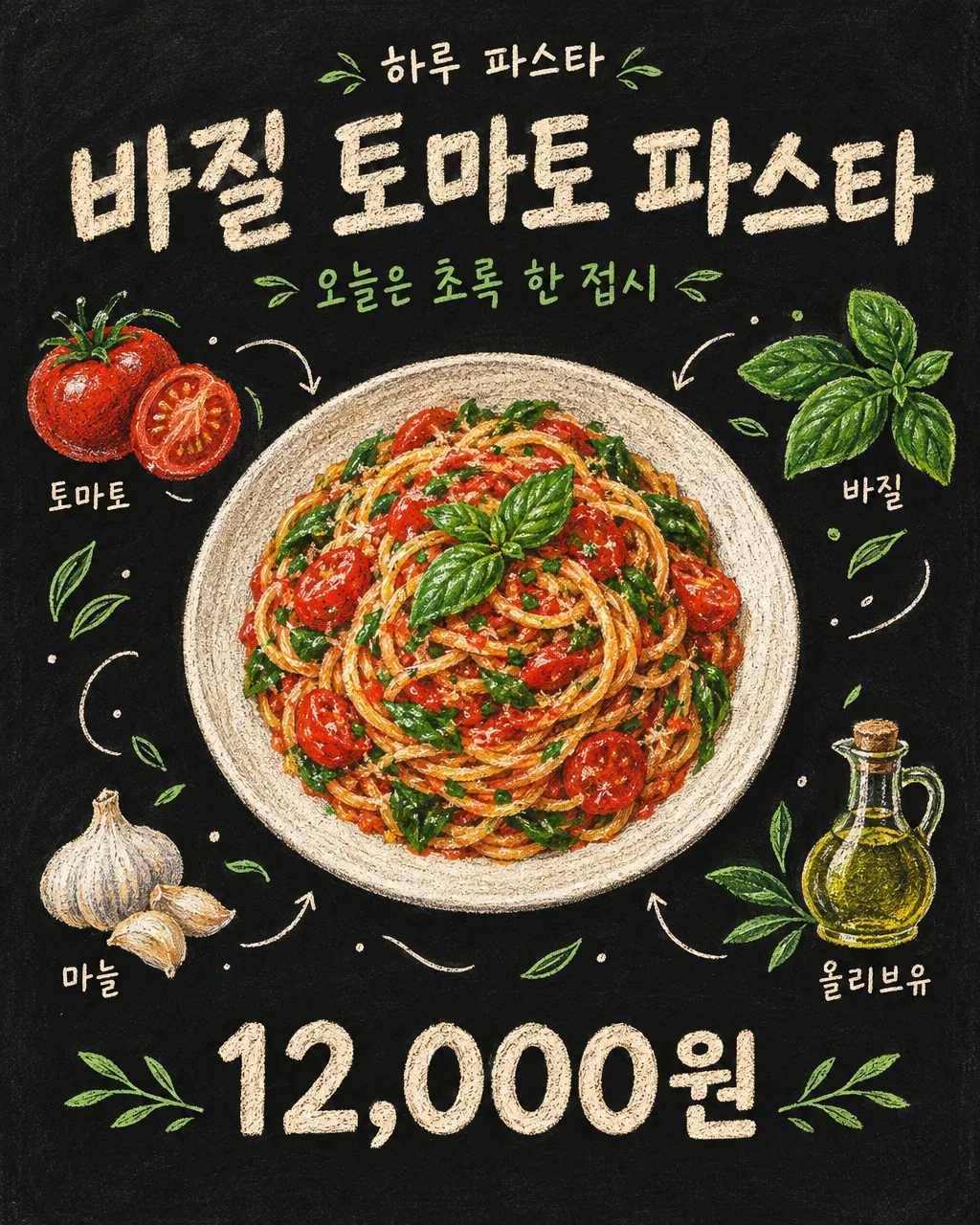
黒板の上に大きな料理と小さな材料の絵をチョークで描きます。カフェの壁やSNSに投稿するための1枚です。
受け取れるもの
- チョーク皿ポスター
項目を入力
- 1項目を入力します
- 2コピーを押します
- 3GPTのチャットに貼り付けます
- 4そのまま送ると、サムネイルの例のような画像になります
- 5カードに合う実際の写真を一緒に入れると反映されます。背景カードなら背景の写真、人物・料理カードならその写真 任意
プロンプト全文を見る 4,046文字
Generate this image now. Return exactly ONE complete image directly. Do not ask questions, browse for photos, return a plan or give a prompt instead of the image.

出力サイズは1080×1350ピクセル、4:5の縦型Instagram投稿にしてください。

[Input: values are the only facts and wording]
SHOP: "【店名】"
MENU: "【メニュー名】"
INGREDIENTS: "【絵に表示する材料】"
COPY: "【短いフレーズ】"
PRICE: "【販売価格】"
PLATE: "【お皿の形】"
FOOD_DETAIL: "【ひとくちポイント】"
LABELS: "【材料名表示】"
UTENSIL: "【食器の絵】"

[Fixed card design]
Create a finished hand-drawn chalk food poster on a matte black chalkboard. The food is painstaking colored chalk and colored-pencil illustration, never a pasted photograph. A generous central serving occupies over half the canvas, viewed slightly from above, with believable volume, uneven ingredient shapes and visible dusty chalk grain. Respect PLATE and FOOD_DETAIL when supplied; otherwise choose a simple plate suited to MENU. Pasta is loose long strands and natural turns, not a rigid coil.
Around the dish, draw only the supplied INGREDIENTS as small separate illustrations, normally three to five. Connect the scene with thin cream chalk curves, tiny leaf marks, restrained dots and short arrows. Use cream lettering and two main colors from the food. Density comes from fine shading on the main dish and lighter outlines in the small drawings, never irrelevant desserts or a mass of extra words. If UTENSIL is not the absent choice, include one modest chalk drawing of that utensil; do not add food to it.
MENU is the largest hand-lettered title, SHOP a small line above, COPY a separate supporting line. PRICE, when present, is one bold clear number group at the bottom, preserving every character. In the show-labels choice, place the exact ingredient name once by each matching drawing. In the drawings-only choice omit all ingredient names but keep the drawings. Default is show-labels. Keep title and price clear of decoration. Visible words consist only of supplied SHOP, MENU, COPY, PRICE and the enabled ingredient names. Do not add promotional claims or origin/nutrition information.

[Button meanings, internal instructions only]
LABELS: "表示する" means show ingredient labels; "イラストのみ" means drawings without labels.
UTENSIL: "なし" means none; "フォーク" means fork; "スプーン" means spoon; "お箸" means chopsticks.

[Missing inputs and finish]
An optional input line removed from this prompt is absent. Do not print its key, invent a substitute caption, ask for it or reserve an empty panel. Choose a fitting simple visual only where the fixed design explicitly permits an automatic default. Selected values alter content only; retain this card's single style and one composition. Every supplied visible string stays verbatim in its original script and currency, without translation. Ordinary automatic lettering, if explicitly allowed above, is Japanese; internal English keys and button names are never captions.
Use the stated aspect ratio, adapting one coherent layout rather than stretching food or letters. Text-bearing posters keep important lettering within the central 16–83% of image height and 5–95% of width; extend food-related ornament, background, shadows or texture to the trim so these insets do not create empty bands. Keep all price digits and ingredient labels unobstructed. Text-free photographs fill the canvas naturally with their scene. No frame, phone, wall mockup, watermark or extra results.
No uploaded photo is needed: create a fictional food scene from these inputs. If a reference photo is attached, use it only for the stated food's visible shape and materials within this same drawing or photographic medium, without adding absent products or claiming exact portion preservation. Finish one image even when no photo is attached.

[Final output format]
出力サイズは1080×1350ピクセル、4:5の縦型Instagram投稿にしてください。
This selected output format takes priority over any fixed canvas size or aspect ratio elsewhere in this template. Adapt the composition, text zones and margins to the selected canvas without stretching or cropping essential content. Device safe areas apply only when a device is selected. Never print these format instructions on the image.
結果はどうでしたか?
こちらのカードも人気です


使い方・よくある質問
黒板の今日のメニューを1枚に
バジルパスタの長くほどけた麺、トマトの断面、バジルの葉をカラーチョークで描くポスターです。大きなお皿の周りに小さな材料の絵とチョークの線が繋がり、メニュー表の文字を変えただけのものとは違う手描き風の仕上がりになります。カフェの壁、本日のメニュー案内、インスタのフィードによく合います。黒い黒板とチョークの画風は決まっているため、画風を選ぶ必要はありません。
4つの欄を先に埋めましょう
店名・メニュー名・絵に表示する材料・短いフレーズを記入します。材料は「トマト、バジル、にんにく、オリーブオイル」のようにカンマで区切った3〜5個が良いでしょう。わからない場合はメニューに合った候補を押して実際の材料に直してください。「今日は緑の一皿」はタイトルの下の1行であり、メニュー名は最も大きく表示されます。価格は表示したいときに「12,000ウォン」のように単位まで記入します。空欄にすると価格とその場所が消えます。
お皿と美味しそうなポイントも変えましょう
お皿の形には「低い白い陶器のボウル」のように食器を1つ記入します。ひとくちのポイントは「焼いた鶏の質感とシャキシャキした葉」のように目で見てわかる特徴です。空欄にするとメニューに合わせて決定されます。材料名の表示を「イラストのみ」にすると周辺の材料は残り、小さなネームプレートだけが外れます。食器の絵はフォーク・スプーン・お箸のいずれかを追加するボタンであり、デフォルトはなしです。このような欄は絵の内容だけを変えてチョークの画風は維持します。
貼り付けて出来上がった絵を読み込んでみましょう
欄を埋めてコピーした文章を画像生成が可能なGPTに一度送ると、完成画像1枚を要求します。写真を探してきたり、レシピを先に作ったりする必要はありません。受け取った後にメニューと価格が正確か、材料の絵の隣の名前が1回ずつだけ書かれているかを確認してください。パスタなのに関係のないイチゴやチョコレートができた場合は「入力した材料4つだけを周りに描いて」とその部分を修正します。写真なしで描いた料理はバーチャルな例であるため、店頭で実際の量を知らせる目的ならば自店のメニューに合わせて確認してください。