
すべて · 広告・ポスター · 飲食店 · カフェ・スイーツ
242落書きフードポップアート
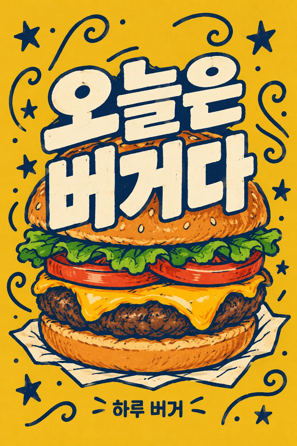
大きな料理の手描きイラストに2行のタイトルを重ね、落書きで背景を埋めます。個人カフェの個性的なフィードポスターです。
受け取れるもの
- 落書きフードポップアート
項目を入力
- 1項目を入力します
- 2コピーを押します
- 3GPTのチャットに貼り付けます
- 4そのまま送ると、サムネイルの例のような画像になります
- 5カードに合う実際の写真を一緒に入れると反映されます。背景カードなら背景の写真、人物・料理カードならその写真 任意
プロンプト全文を見る 4,045文字
Generate this image now. Return exactly ONE complete image directly. Do not ask questions, browse for photos, return a plan or give a prompt instead of the image.

完成した2:3の縦型画像を1枚、1024×1536ピクセルで出力してください。重要な文字は上12%と下15%に置かないでください。

[Input: values are the only facts and wording]
MENU: "【メニュー】"
HEADLINE: "【大きなタイトル】"
SHOP: "【店名】"
BACKGROUND: "【背景色】"
FOOD_DETAIL: "【目に見える材料】"
DOODLES: "【周辺の落書き】"
VESSEL: "【料理の受け皿】"

[Fixed card design]
Create one independent-cafe pop-art print poster. Broad BACKGROUND color, deep navy hand-drawn outlines, warm cream letters and the natural dominant food colors. Render a large recognizable MENU in bold flattened color shapes and irregular ink lines, with small brush grain, no photo, 3D or glossy gradient. Use FOOD_DETAIL when supplied; otherwise the ordinary named food. The food occupies around 70% of the height. VESSEL is a believable small support, not an extra menu item.
HEADLINE has TWO intended lines: interpret either slash / or full-width slash / as a visual line break, never print a slash or translate or add words. The two cream lines are extremely bold, slightly irregular and tightly stacked over the middle of the food as a print-magazine cover. Keep letter cores and the defining food silhouette readable; the food can peek around and between letter shapes. SHOP appears once as a compact low line. MENU is a drawing instruction and is not repeated as another caption.
Fill the remaining backdrop with the selected DOODLES in one slightly darker outline color. Map its localized button value to stars and curling lines, forks and waves, or leaves and dots. The default is stars and curls. Vary sizes and spacing so the marks form a rhythm around the food; keep them out of letter counters and faces of ingredients. Density comes from the connected outlines and layering, with a clear oversized headline. No price, ingredient labels, filler English, health claims or unrelated food. Only the exact two HEADLINE lines and SHOP are visible text.

[Button meanings, internal instructions only]
BACKGROUND: "マスタードイエロー" means mustard yellow; "コーラルレッド" means coral red; "オリーブグリーン" means olive green; "濃い青緑" means deep teal.
DOODLES: "星とうねうね線" means stars and curling lines; "フォークと波線" means forks and waves; "葉っぱと小さな点" means leaves and dots.

[Missing inputs and finish]
An optional input line removed from this prompt is absent. Do not print its key, invent a substitute caption, ask for it or reserve an empty panel. Choose a fitting simple visual only where the fixed design explicitly permits an automatic default. Selected values alter content only; retain this card's single style and one composition. Every supplied visible string stays verbatim in its original script and currency, without translation. Ordinary automatic lettering, if explicitly allowed above, is Japanese; internal English keys and button names are never captions.
Use the stated aspect ratio, adapting one coherent layout rather than stretching food or letters. Text-bearing posters keep important lettering within the central 16–83% of image height and 5–95% of width; extend food-related ornament, background, shadows or texture to the trim so these insets do not create empty bands. Keep all price digits and ingredient labels unobstructed. Text-free photographs fill the canvas naturally with their scene. No frame, phone, wall mockup, watermark or extra results.
No uploaded photo is needed: create a fictional food scene from these inputs. If a reference photo is attached, use it only for the stated food's visible shape and materials within this same drawing or photographic medium, without adding absent products or claiming exact portion preservation. Finish one image even when no photo is attached.

[Final output format]
完成した2:3の縦型画像を1枚、1024×1536ピクセルで出力してください。重要な文字は上12%と下15%に置かないでください。
This selected output format takes priority over any fixed canvas size or aspect ratio elsewhere in this template. Adapt the composition, text zones and margins to the selected canvas without stretching or cropping essential content. Device safe areas apply only when a device is selected. Never print these format instructions on the image.
結果はどうでしたか?
こちらのカードも人気です


使い方・よくある質問
料理と大きな文字を重ねたポスター
丸いバーガーのバンズとチーズの上に「今日は / バーガーだ」という2行を大きく重ね、残りの背景を星やうねうねした線で埋めるポップアートです。写真のツヤよりもフラットな色と太い手描きの線が際立ちます。個人カフェのフィード、フードイベントの雰囲気の投稿、飲食店の壁の装飾によく合います。大きな文字と料理がひとつの塊として読める1枚です。
タイトルの中央のスラッシュは改行です
メニュー・大きなタイトル・店名を先に埋めます。大きなタイトルは「今日は / バーガーだ」のように短い2つの塊の間にスラッシュを書きます。イラストではスラッシュが消えて2行に変わります。メニューの欄はバーガーやパスタのように何を描くかを決める言葉であり、絵に別のメニュータイトルとして描き込まれません。例文のタイトルを押した後に、今回のメニューと言葉が合っているか確認します。
同じポップアートの中で変える欄
背景色はマスタードイエロー・コーラルレッド・オリーブグリーン・濃い青緑の中から選びます。料理自体の色はそのままです。目に見える材料には、バーガーならバンズ・パティ・チーズ・トマト・レタスのように見える材料を書きます。周辺の落書きは星とうねうね線、フォークと波線、葉っぱと小さな点のいずれか1セットです。料理の受け皿は紙・器・まな板の候補を押して変更でき、空欄にしてもメニューに合った受け皿を決めて完成させます。
小さく縮小してタイトルを読んでみましょう
GPTにコピーした文章を一度貼り付けて画像1枚を受け取ります。出てきた画像をスマホのリスト程度に縮小して2行を読んでみてください。落書きがベースを隠したり、バーガーが何かわからない場合は「タイトルのストロークはそのままにして料理のアウトラインとチーズをもっと見せて」と修正します。タイトルを長く伸ばすとイラストの主役が小さくなりやすいため、欄に入れる言葉から短めに設定するのがおすすめです。価格や割引の数字をつける店舗の価格案内よりも、個性的なSNS表現に向いています。