
전체 · 인포그래픽/안내 · 매장 안내문
390가게 이전 안내 — 새 주소와 약도 한 장
출입문과 창에 붙이는 이전 안내문 — 큰 한 줄, 새 주소와 상징 약도, 이전 날짜와 휴무를 한 장에
ChatGPT 무료 OK
칸 채우기
- 1칸을 채워요
- 2복사 버튼을 눌러요
- 3GPT 채팅창에 붙여넣어요
- 4그대로 보내면 썸네일 예시처럼 나와요
- 5카드에 맞는 실제 사진을 같이 넣으면 그 사진이 반영돼요 — 배경 카드는 배경 사진, 인물 · 음식 카드는 그 사진 선택
프롬프트 원문 보기 3,455자
Generate this image now. Draw directly and return one finished image only.
Output exactly one finished 2:3 portrait image, 1024x1536 pixels. Keep all important text inside the central 73% of image height: leave the top 12% and bottom 15% free of essential lettering.
Create a flat full-bleed printable relocation notice for a shop door or window. One fixed hierarchy: shop, largest headline, new address, one simple symbolic diagram, opening date, optional closure, optional thanks. No frame, paper mockup, collage or photograph upload. Use Korean for generated lettering.
SHOP: "【가게 이름】"
HEADLINE: "【큰 한 줄】"
ADDRESS: "【새 주소】"
LANDMARKS: "【랜드마크】"
DATE: "【이전 날짜】"
CLOSURE: "【휴무 기간】"
THANKS: "【고마움 한 줄】"
MOOD: "【분위기】"

Resolve each string once. If HEADLINE is "알아서 골라줘", derive a concise Korean equivalent of "Meet us at our new location from [month and day]" using DATE, without inventing a date. If THANKS is "알아서 골라줘", use "늘 함께해 주셔서 고맙습니다". Otherwise preserve display strings exactly, including address digits. Before drawing, verify any weekday against the actual calendar; use web verification when available. Correct a supplied wrong weekday to the verified weekday, or omit the weekday if verification is unavailable. Do not invent dates. Headline and DATE must refer to the same opening date. Do not fabricate or extend the supplied closure period.

Use shop at 14%-20%, headline at 22%-34%, address at 36%-44%, diagram at 46%-65%, date and closure at 67%-77%, thanks at 80%-84%. Keep all important text outside top 12% and bottom 15%, with generous side safety margins. Make the headline a single large continuous line using condensed bold intact lettering; never crop characters. Fill every edge with the background. Adapt these zones to the selected ratio while preserving readable type.

Three atmosphere values change palette and illustration treatment only:
"따뜻한 일러스트": cream ground, forest-green lettering, coral accent and warm hand-painted generic icons.
"깔끔한 안내": pale blue ground, navy bold sans-serif lettering, orange accent and simple flat icons.
"레트로": pale peach ground, burgundy bold retro lettering, teal accent and original painted icons.
Never print MOOD or mix styles.

Diagram: draw only generic named facilities and supplied spatial relationships; a few simple road strokes, a shop icon labelled SHOP and generic landmark icons. "Next to" means neighbouring icons; "in front/across from" means across a road. Do not infer route distances, compass directions, street names, transit numbers or walking times. LANDMARKS blank: omit the entire diagram and enlarge ADDRESS. CLOSURE blank: omit its entire row and badge. THANKS blank: omit its entire row. Rebalance remaining elements without blank placeholders. Address, opening date and closure may have concise Korean labels but no added claims.

No actual map-service screen, map tiles, map UI, real brand logo, recognisable trade dress, protected character, person, product, watermark or signature. Generic facilities must use original unbranded designs. No extra text, explanatory notes or verification labels in the image. Proof every character, numeral and punctuation against the resolved inputs. One paste produces one complete image; no code, compositing, cropping or retouching workflow.

[Final output format]
Output exactly one finished 2:3 portrait image, 1024x1536 pixels. Keep all important text inside the central 73% of image height: leave the top 12% and bottom 15% free of essential lettering.
This selected output format takes priority over any fixed canvas size or aspect ratio elsewhere in this template. Adapt the composition, text zones and margins to the selected canvas without stretching or cropping essential content. Device safe areas apply only when a device is selected. Never print these format instructions on the image.
결과 어땠어요?
이 카드도 많이 사용해요
쓰는 법 · 자주 묻는 것
출입문에 붙이는 이전 소식
가게가 이사할 때 손님이 새 자리를 찾도록 만드는 인쇄 안내문입니다. 큰 문구, 새 주소, 상징 약도, 이전 날짜, 휴무와 감사 인사를 한 장에 담아요. 그림 AI에 완성된 프롬프트를 한 번 붙여 넣으세요. 사진 첨부 없이 그림을 만들며 실제 지도 화면을 복제하지 않습니다.
칸에 넣을 내용
꼭 채울 칸은 5개입니다. 가게 이름에는 상호, 큰 한 줄에는 손님이 먼저 읽을 문구, 새 주소에는 도로명과 건물번호, 이전 날짜에는 연도까지 포함한 날짜, 분위기에는 원하는 색감을 넣으세요. 랜드마크에는 ‘편의점 옆 / 버스정류장 앞’처럼 일반 시설과 위치 관계를 함께 적습니다. 시설 이름을 지어내거나 실제 거리와 방향을 추측하지 않아요. 랜드마크를 비우면 약도는 빠지고 주소를 더 크게 배치합니다. 휴무 기간과 고마움 한 줄을 비우면 각각 해당 줄이 사라집니다. 휴무가 없는 경우에는 비워 두세요.
큰 한 줄의 ‘알아서 골라줘’는 이전 날짜의 월·일을 써서 ‘○월 ○일부터 새 자리에서 만나요’로 정합니다. 감사 인사의 같은 보기는 ‘늘 함께해 주셔서 고맙습니다’로 정해요. 다른 문구를 넣으면 그대로 출력하며 영업시간이나 할인, 주차 가능 여부를 추가하지 않습니다.
분위기와 예시
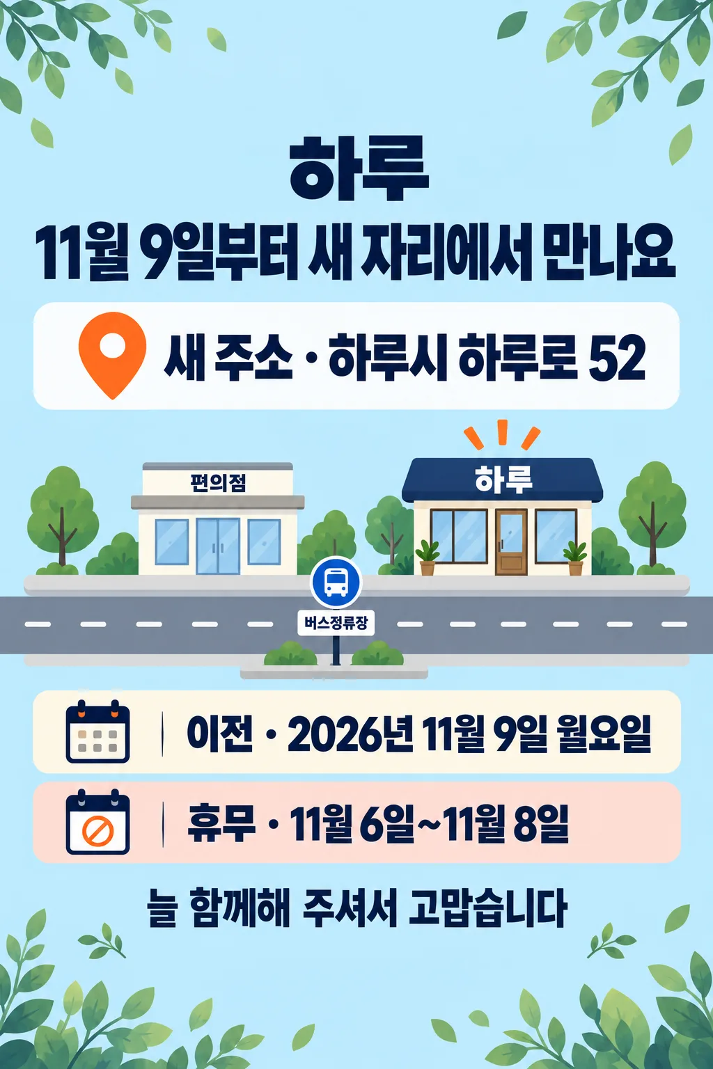
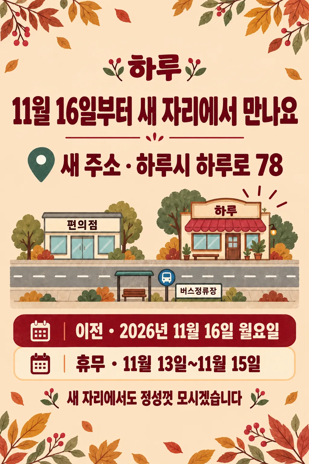
따뜻한 일러스트는 크림색과 초록 글씨, 깔끔한 안내는 연한 파랑과 진한 남색의 단순한 아이콘, 레트로는 연한 복숭아색과 버건디 글씨를 씁니다. 모두 같은 이전 안내문 구조이며 다른 결과 종류를 선택하는 칸은 없습니다. 표지는 하루 · 하루시 하루로 34 · 2026년 11월 2일 월요일 · 휴무 10월 30일~11월 1일입니다. 첫 예시는 하루로 52, 11월 9일 월요일과 휴무 11월 6일~8일의 깔끔한 안내, 둘째는 하루로 78, 11월 16일 월요일과 휴무 11월 13일~15일의 레트로입니다. 주소와 시설 배치는 가상이며 실제 지도 대신 관계만 보여 줍니다.
인쇄 전 확인과 질문
상호의 받침, 주소 숫자, 큰 문구 날짜, 이전 날짜와 요일, 휴무 시작·끝 날짜를 원문과 한 글자씩 대조하세요. 큰 문구와 이전 날짜가 같아야 합니다. 요일은 실제 달력과 확인하고 휴무가 이전 날짜까지 이어지는 오류도 확인합니다. 확인이 어려운 요일은 붙이지 않습니다. 약도를 실제 길찾기 지도로 써도 되나요? 아니요, 실제 매장 주변 위치와 대조한 후 붙이세요. 긴 주소가 작게 나오면 필요한 건물번호는 유지하고 불필요한 설명을 줄여 다시 생성하세요. 기본 비율은 2:3이며 인쇄 용지 크기와 해상도를 확인하고, 문과 창에서 읽히는지 실제 크기로 시험 출력하세요. 글자 합성이나 후보정 없이 완성된 이미지 한 장을 받습니다. 외부 서비스의 요금과 이용 조건은 해당 서비스에서 확인하세요.