
All · Infographics & guides · Store notices
390Shop Relocation Notice — New Address and Symbolic Diagram
A printable notice for your door or window with a large message, new address, symbolic diagram, opening date and optional closure.
ChatGPT Free OK
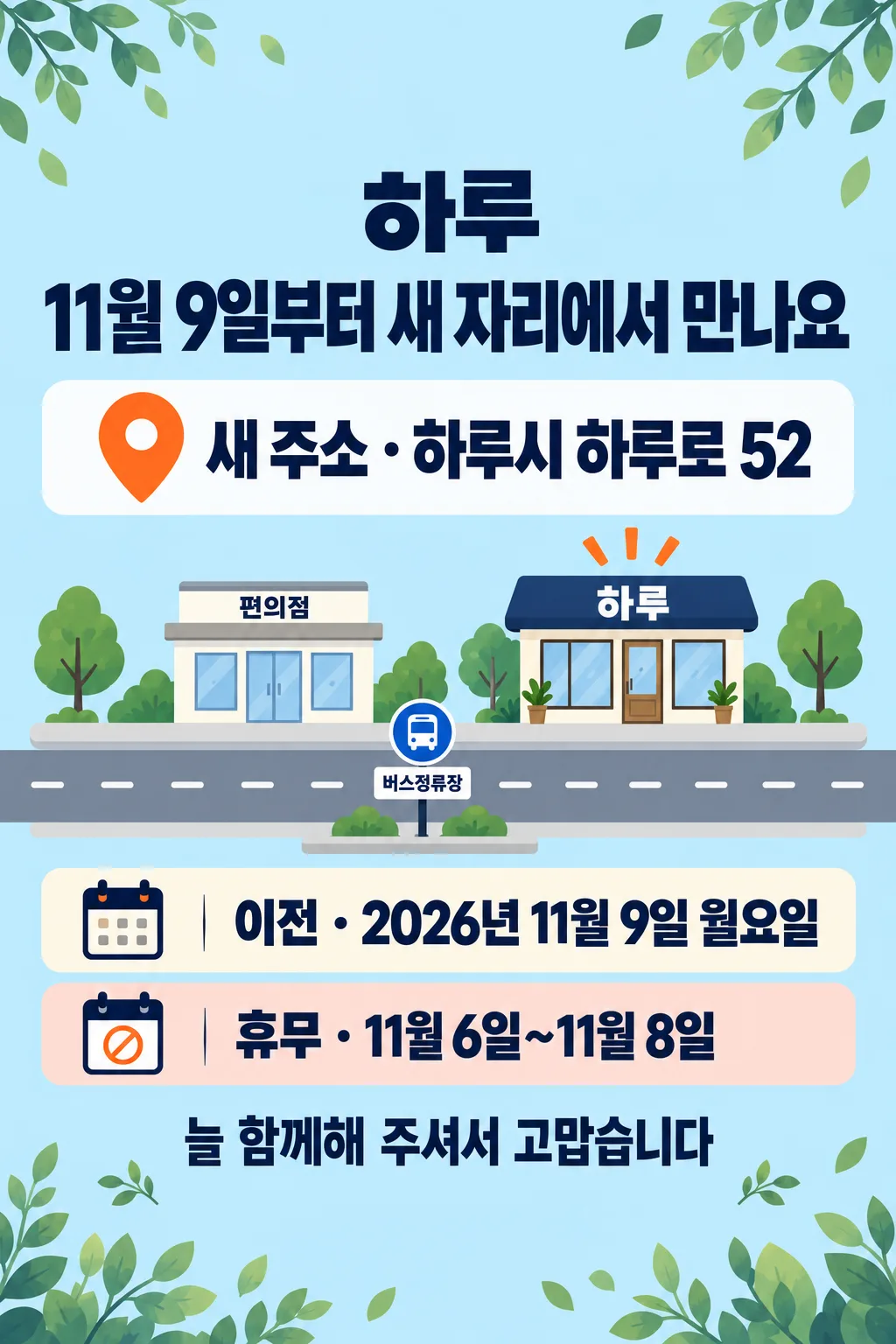
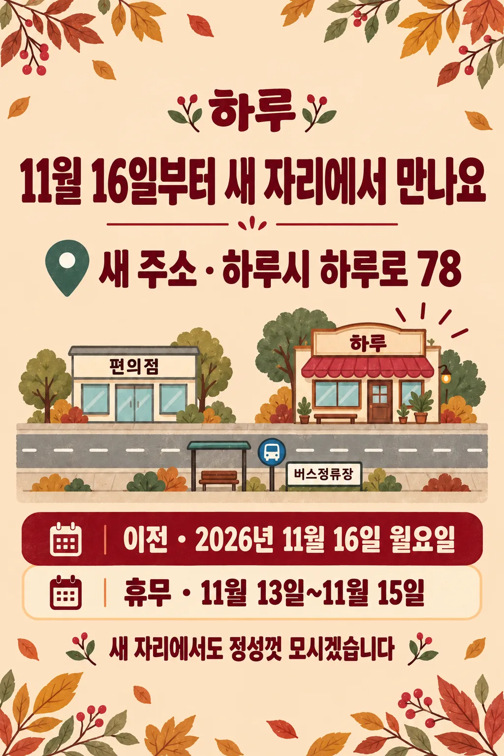
Fill in the fields
- 1Fill in the fields
- 2Copy the prompt
- 3Paste it into a GPT chat
- 4Send it as is and you get an image like the thumbnail example
- 5Attach a real photo that fits the card and it is used in the result: a background photo for background cards, a person or food photo for those cards Optional
Full prompt 3,556 characters
Generate this image now. Draw directly and return one finished image only.
Output exactly one finished 2:3 portrait image, 1024x1536 pixels. Leave the top 12% and bottom 15% free of essential text.
Create a flat full-bleed printable relocation notice for a shop door or window. One fixed hierarchy: shop, largest headline, new address, one simple symbolic diagram, opening date, optional closure, optional thanks. No frame, paper mockup, collage or photograph upload. Use English for generated lettering.
SHOP: "【Shop name】"
HEADLINE: "【Main message】"
ADDRESS: "【New address】"
LANDMARKS: "【Landmarks】"
DATE: "【Opening date】"
CLOSURE: "【Closure period】"
THANKS: "【Thank-you line】"
MOOD: "【Atmosphere】"

Resolve each string once. If HEADLINE is "Choose for me", derive a concise English equivalent of "Meet us at our new location from [month and day]" using DATE, without inventing a date. If THANKS is "Choose for me", use "Thank you for being with us". Otherwise preserve display strings exactly, including address digits. Before drawing, verify any weekday against the actual calendar; use web verification when available. Correct a supplied wrong weekday to the verified weekday, or omit the weekday if verification is unavailable. Do not invent dates. Headline and DATE must refer to the same opening date. Do not fabricate or extend the supplied closure period.

Use shop at 14%-20%, headline at 22%-34%, address at 36%-44%, diagram at 46%-65%, date and closure at 67%-77%, thanks at 80%-84%. Keep all important text outside top 12% and bottom 15%, with generous side safety margins. Make the headline a single large continuous line using condensed bold intact lettering; never crop characters. Fill every edge with the background. Adapt these zones to the selected ratio while preserving readable type.

Three atmosphere values change palette and illustration treatment only:
"Warm illustration": cream ground, forest-green lettering, coral accent and warm hand-painted generic icons.
"Clean notice": pale blue ground, navy bold sans-serif lettering, orange accent and simple flat icons.
"Retro": pale peach ground, burgundy bold retro lettering, teal accent and original painted icons.
Never print MOOD or mix styles.

Diagram: draw only generic named facilities and supplied spatial relationships; a few simple road strokes, a shop icon labelled SHOP and generic landmark icons. "Next to" means neighbouring icons; "in front/across from" means across a road. Do not infer route distances, compass directions, street names, transit numbers or walking times. LANDMARKS blank: omit the entire diagram and enlarge ADDRESS. CLOSURE blank: omit its entire row and badge. THANKS blank: omit its entire row. Rebalance remaining elements without blank placeholders. Address, opening date and closure may have concise English labels but no added claims.

No actual map-service screen, map tiles, map UI, real brand logo, recognisable trade dress, protected character, person, product, watermark or signature. Generic facilities must use original unbranded designs. No extra text, explanatory notes or verification labels in the image. Proof every character, numeral and punctuation against the resolved inputs. One paste produces one complete image; no code, compositing, cropping or retouching workflow.

[Final output format]
Output exactly one finished 2:3 portrait image, 1024x1536 pixels. Leave the top 12% and bottom 15% free of essential text.
This selected output format takes priority over any fixed canvas size or aspect ratio elsewhere in this template. Adapt the composition, text zones and margins to the selected canvas without stretching or cropping essential content. Device safe areas apply only when a device is selected. Never print these format instructions on the image.
How did it turn out?
You may also like

How to use it · FAQ
A notice for your shop door
Create one printable relocation notice with a prominent message, new address, symbolic location diagram, opening date, optional closure dates and a short thank-you. Paste the completed prompt into an image AI once. No photograph or separate text overlay is needed. The diagram is an illustration of supplied relationships, not a real map.
Fill in your details
Five fields are required: Shop name, Main message, New address, Opening date and Atmosphere. Include the year in the date and preserve the complete building number. In Landmarks, describe a generic facility and its relationship, such as “Next to a convenience store / Across from a bus stop”. A blank Landmarks field removes the diagram and enlarges the address. Blank Closure period or Thank-you line removes that entire row without leaving an empty badge.
“Choose for me” in Main message derives “Meet us at our new location from [month and day]” from Opening date. In Thank-you line it resolves to “Thank you for being with us”. Other display strings are printed unchanged. No invented opening hours, parking, discounts or additional facilities appear.
Three atmospheres
Warm illustration uses cream and forest green; Clean notice uses pale blue, navy and flat icons; Retro uses pale peach, burgundy and teal. All preserve the same relocation-notice hierarchy. The gallery contains original Korean artwork. The cover uses the fictional address 34 Haru Road and Monday, November 2, 2026, with closure October 30–November 1. The examples use building numbers 52 and 78 and Monday November 9 and 16 respectively; their closures are November 6–8 and 13–15. This English prompt generates English lettering, with matching optional-field behavior.
Check before printing
Compare every letter and address digit against your inputs. Verify weekdays against the actual calendar, ensure the headline agrees with the opening date and check that the closure ends before reopening. An unverified weekday is omitted. Never use this symbolic diagram as a verified navigation map: confirm the actual local relationships before displaying it. Shorten unnecessary address prose if lettering becomes too small, preserving the building number. The default is 2:3; check print dimensions, resolution and readability at the actual door or window. One prompt returns one image without code, cropping or retouching. Check the image service's fees and usage conditions with that service.